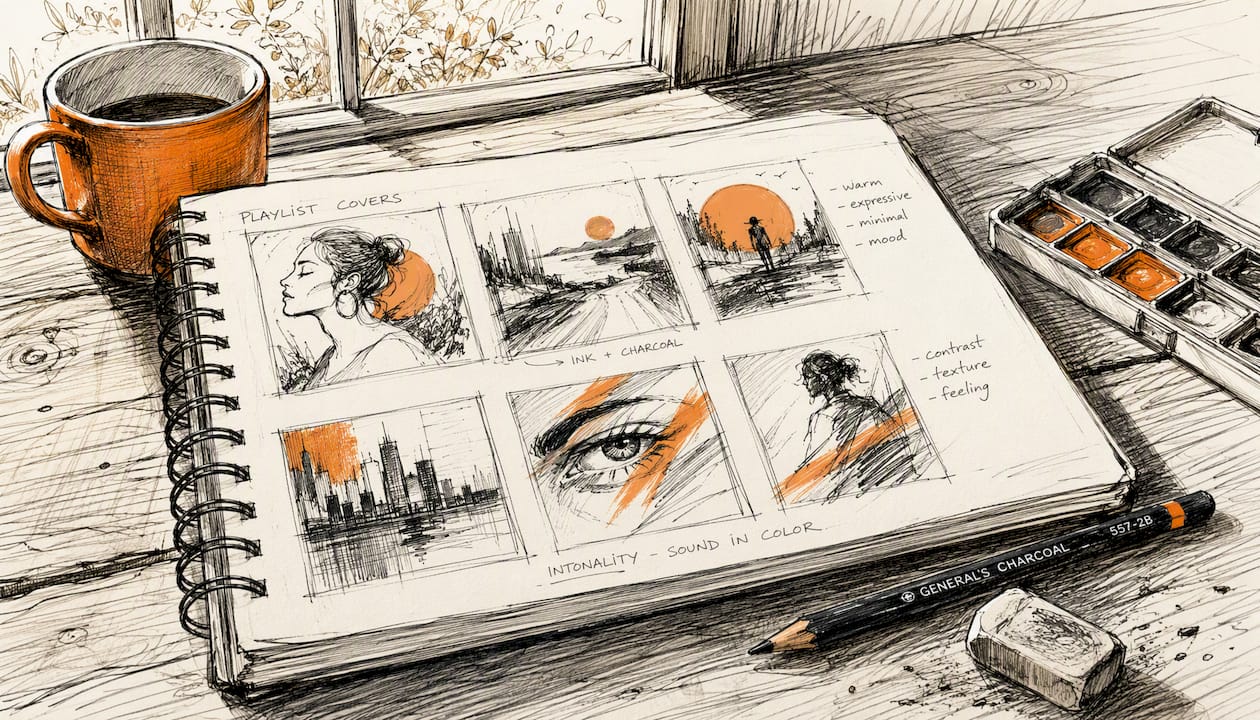
The cover art you attach to a curator pitch should be a square 1:1 image, at least 3000 × 3000 pixels (300 × 300 px is the platform’s absolute floor, but for professional pitches 3000 × 3000 px is the recommended minimum), with one strong focal element, high contrast, and genre-matched typography that reads clearly at 60 pixels wide. Curators scan dozens of submissions fast, and a blurry or cluttered thumbnail signals amateur work before they ever press play.
Pitch-ready specs you can use right now:
- Format: Square 1:1, PNG or JPEG
- Minimum size: 3000 × 3000 px (300 × 300 px absolute floor per VistaCreate’s guidance)
- Thumbnail test: Shrink to 60 px and confirm the focal element and any title text are still readable
- Pitch attachment: One high-res file + one inline thumbnail embedded in the email or form; add a single sentence describing mood, tempo, and release date
Table of Contents
- Why does playlist cover art change a curator’s decision?
- What every pitch-ready playlist cover must include
- Which tools help you build a curator-grade cover fast?
- What copyright checks must you run before uploading cover art?
- How should you present cover art inside a curator pitch?
- Genre-specific visual directions curators recognize instantly
- Final pre-submit checklist before you pitch or upload
- Key Takeaways
- Cover art is only half the equation
- Intonality gets your polished cover in front of real curators
Why does playlist cover art change a curator’s decision?
Curators use cover art as a rapid credibility and genre signal when triaging submissions. Before they hit play, the image tells them whether you understand the playlist’s mood. A cover that matches the vibe confirms you did your homework; one that clashes suggests a spray-and-pray submission.
The UI mechanics reinforce this. On mobile, playlist tiles render at roughly 60–80 pixels. A busy photo with four faces and small text collapses into visual noise at that size. Streaming platforms consistently recommend a single focal element and bold contrast precisely because the tile is so small.
Three curator behaviors shift when the art is strong:
- Faster triage: A genre-appropriate cover lets a curator categorize your track in seconds, reducing friction before they listen.
- Higher engagement expectation: Polished art signals that the full release is equally considered, which raises the curator’s confidence in the track.
- Perceived reliability: Consistent visual branding across your Spotify profile, social media, and pitch materials reads as professionalism, not luck.
Pro Tip: Keep your color palette consistent across your artist photo, cover art, and pitch email header. Curators who receive multiple submissions from the same artist notice when the visual identity holds together, and it builds trust faster than any bio paragraph.
What every pitch-ready playlist cover must include
Think of this as a pre-flight list, not a creative brief. Run through it before you attach anything.
Design checklist:
- 1:1 aspect ratio, no exceptions
- Minimum 3000 × 3000 px for streaming; 300 × 300 px is the platform floor, not the target
- One dominant focal element (a face, an object, an abstract shape)
- High contrast between background and foreground
- Title or wordmark text readable at thumbnail size (test at 60 px)
- No more than two lines of text; avoid full sentences
- No unlicensed imagery, logos, or recognizable faces without releases
- Avoid multi-person group photos where no single element dominates
Usability checks:
- View the cover in both light and dark UI mockups (Spotify uses both)
- Confirm the background is simple enough to hold up on a small phone screen
- Check that any artist wordmark does not crowd the focal image
Quick dos and don’ts:
| Do | Don’t |
|---|---|
| Use bold shapes and high-contrast color | Use tiny decorative type |
| Export as high-res PNG | Export at 72 dpi for web only |
| Match palette to genre mood | Use a generic stock photo |
| Test at 60 px thumbnail | Skip the thumbnail check |
Pro Tip: Bold geometric shapes and a single saturated color block read better at thumbnail size than any photograph. If your focal image is a photo, add a high-contrast color overlay to anchor it.
Which tools help you build a curator-grade cover fast?
Use a hybrid workflow: generate concepts quickly, then polish for resolution and branding consistency. Here is how the main tools stack up.

Canva offers pre-sized playlist cover templates with an editable font catalog. You can swap colors, upload your own photo, and export PNG or JPEG in minutes. The Brand Kit feature lets you lock in your palette and fonts so every cover stays consistent.
Ambience AI generates square 1:1 artwork from a mood or genre prompt, delivers high-res PNG/JPEG downloads, and includes commercial usage rights in the output. It is the fastest path from “I need a dark pop cover” to a usable file.
Spotify’s native mobile editor, rolled out in beta across 65 markets, lets you upload images, apply the Spotify Mix typeface, add stickers, and mask images directly in the app. The catch: it stores only one custom cover per playlist. To keep multiple versions, you need to duplicate the playlist first.
VistaCreate and similar template editors are solid for quick exports with pre-built genre templates. VistaCreate lists a minimum of 300 × 300 px and a maximum file size of 4 MB for Spotify-friendly exports.
Recommended export specs:
| Platform | Aspect Ratio | Recommended Size | File Type | Max File Size |
|---|---|---|---|---|
| Spotify | 1:1 | 3000 × 3000 px | PNG / JPEG | 4 MB |
| Apple Music | 1:1 | 3000 × 3000 px | PNG / JPEG | Not publicly listed |
| YouTube Music | 1:1 | 3000 × 3000 px | PNG / JPEG | Not publicly listed |
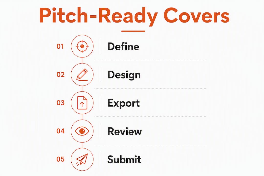
End-to-end workflow:
- Pick a Canva template or enter a mood prompt in Ambience AI
- Choose one focal image or abstract element
- Set a single bold color and add a short title or wordmark
- Export as high-res PNG at 3000 × 3000 px
- Shrink to 60 px and confirm it still reads clearly
What copyright checks must you run before uploading cover art?
You must clear image rights before pitching or uploading. Spotify’s support documentation explicitly warns that custom playlist artwork must not violate copyright, trademark, or personal image rights, and that non-compliant images can be removed.
Rights checklist:
- Use original photography you shot yourself, or stock images with a commercial license that covers streaming use
- Secure signed model releases for any identifiable person in the image
- Obtain property releases for recognizable private locations
- Never use brand logos, sports team marks, or trademarked imagery unless you hold a license
- AI-generated art from tools like Ambience AI typically includes commercial usage rights, but confirm the platform’s terms before uploading
Pro Tip: Keep a single PDF with your license receipts, stock image source URLs, and any model release forms. If a curator or distributor asks for proof of rights, you can send it in one attachment instead of scrambling.
How should you present cover art inside a curator pitch?
Include the cover as an inline thumbnail in the email or submission form body, and attach one high-res file separately. Then add a single sentence that names the mood, tempo, and release date.
Sample one-line pitch descriptions:
- “Moody, mid-tempo dark pop, 98 BPM, releasing March 14 — fits the late-night introspective feel of your playlist.”
- “High-energy EDM drop, 128 BPM, available now — built for the peak-hour section of your set.”
Attachment guidelines:
- Filename:
ArtistName_TrackName_Cover_3000x3000.png - Keep the file under 4 MB
- If the submission form limits uploads, host the file on Google Drive or Dropbox and paste a direct download link
- Match the mood language in your pitch text to the visual cues in the cover (genre keywords, color references)
Pro Tip: Curators who receive 50+ pitches a week notice when the cover, the pitch language, and the track itself all point to the same mood. Mismatches, like a bright pastel cover attached to a pitch describing “dark, brooding soundscapes,” create doubt before they listen.
Genre-specific visual directions curators recognize instantly
Typography, color, and imagery aligned to a playlist’s emotional arc help curators recognize genre fit at a glance. Each genre has a handful of predictable visual cues.
- EDM / high-energy: Bold sans-serif type, neon or electric color palette, abstract geometric focal element. Avoid photography; shapes and gradients read faster at small sizes.
- Dark pop: Deep jewel tones or near-black backgrounds, a single face or silhouette, serif or distressed type. The contrast between a dark field and one lit element creates the tension the genre promises.
- Ambient / bedroom electronica: Soft gradients, muted pastels, no hard edges. Script or thin sans-serif type. The cover should feel like it is slightly out of focus.
- Phonk / lo-fi: Grainy textures, desaturated color, vintage or Japanese typography references. A single object or landscape works better than a face.
- Indie / folk: Warm earth tones, film-grain textures, hand-drawn or serif type. Natural imagery (trees, fields, windows) signals the acoustic intimacy curators expect.
- Rock / metal: High contrast black and white or deep red, aggressive type weight, a single powerful image (instrument, fist, abstract texture). Band photos work here, but only if one figure dominates the frame.
On the artist wordmark question: include it when you have an established visual identity. Skip it when the cover image is strong enough to stand alone, or when the wordmark would crowd the focal element at thumbnail size.
Final pre-submit checklist before you pitch or upload
Export checks:
- 1:1 aspect ratio confirmed
- 3000 × 3000 px minimum, file under 4 MB
- PNG or JPEG, exported at full resolution (not screen-optimized 72 dpi)
Rights checks:
- Image source licensed for commercial streaming use
- Model and property releases signed and saved
- License PDF ready to send on request
Pitch checks:
- Thumbnail embedded inline in the email or form
- High-res file attached or linked with a direct download URL
- One-line mood/tempo/release description included
- Filename follows the
ArtistName_TrackName_Cover_3000x3000.pngconvention
Distribution checks:
- If you need multiple cover versions for different playlists, duplicate the Spotify playlist before applying a new cover in the mobile editor
- Confirm whether the curator hosts the playlist themselves or expects you to upload to your own Spotify account
Pro Tip: Send yourself a test email with the cover attached and view it on your phone before submitting. If the thumbnail in the email preview looks muddy or unreadable, the curator’s inbox will show the same thing.
Key Takeaways
Strong cover art is the fastest credibility signal a curator receives, and a 3000 × 3000 px, high-contrast, genre-matched image with a single focal element is the standard every pitch-ready submission should meet.
| Point | Details |
|---|---|
| Square format is non-negotiable | Export at 1:1 aspect ratio, minimum 3000 × 3000 px (absolute minimum is 300 × 300 px but 3000 × 3000 px is the industry standard), PNG or JPEG under 4 MB. |
| Thumbnail test before you send | Shrink the cover to 60 px and confirm the focal element and any text remain readable. |
| Rights clearance is required | Use licensed or original imagery and keep a PDF of receipts before uploading to Spotify. |
| Pitch presentation matters | Embed a thumbnail inline and attach the high-res file; add one sentence naming mood, tempo, and release date. |
| Intonality amplifies polished art | Campaigns averaging 4–11 playlist placements pair best with genre-matched covers that signal professionalism to vetted curators. |
Cover art is only half the equation
Most advice on playlist cover design stops at the visual. What it misses is that a great cover only works when it reaches the right curator, and that is the part most independent artists get wrong.
From what Intonality’s campaign data consistently shows, artists who combine genre-matched cover art with a personalized pitch to a vetted curator outperform those who submit the same track with generic artwork to every playlist in sight. The cover signals genre fit in the first half-second. The pitch confirms it. When those two things align, the curator’s decision gets easier, not harder.
The genre-specific playlists Intonality curates, from dark pop to indie to metal, each have a distinct visual identity. That is not accidental. Curators who manage genre-specific playlists develop a visual vocabulary for what belongs, and a cover that speaks that language gets a longer listen.
The written feedback Intonality provides after every curator decision is also worth noting here. Artists who receive that feedback learn, sometimes for the first time, that the cover was the friction point, not the track. That is information you cannot get from a streaming dashboard.
Intonality gets your polished cover in front of real curators
You have the cover. Now it needs to reach someone who can actually place it.
Intonality runs personalized pitch campaigns to vetted, genre-matched Spotify playlist curators, with real-time updates and written feedback on every curator decision. No automated blasts, no fake playlists. Artists receive an average of 4 to 11 playlist placements per campaign depending on the tier, and every rejection comes with a written reason so you know exactly what to adjust.
A genre-matched cover attached to a personalized pitch is the combination that moves curators. Intonality handles the pitch side, including pre-release submissions, so your track lands on the right playlists before release day. Submit your track and let real curators hear what you made.