
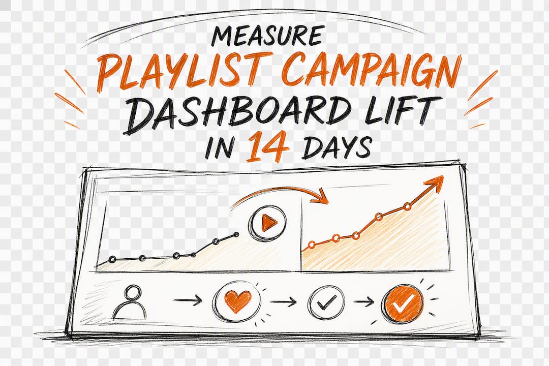
A playlist campaign dashboard shows which playlists added your track, logs curator feedback and timestamps, and separates real streaming lift from noise so you can decide what to do next. Check your placement list against Spotify for Artists, read the curator notes tied to each decision, and confirm the numbers before you plan your next move. Tools like Spotify Campaign Kit and services like Intonality build these signals into a single view.
TL;DR:
- Playlist campaign dashboards can show which curators added your track, their feedback, and whether the placements lead to genuine listener engagement.
- Metrics like streams, save rates, and stream-to-follower ratios are more reliable indicators of campaign success than follower counts alone.
- Detecting low-quality or fake playlists involves analyzing follower-to-listener ratios, geographic clustering, and engagement signals like save rates.
- Using pre/post analysis with a baseline and considering coincident promotional efforts helps measure true campaign lift accurately.
- Combining data from Spotify for Artists, third-party tools, and manual logs provides a comprehensive view to assess and optimize playlist promotion outcomes.
Table of Contents
- What Does a Playlist Campaign Dashboard Actually Show?
- Which Metrics Actually Tell You the Campaign Is Working?
- How Do You Spot a Fake or Low-Quality Playlist?
- How Do You Measure Real Campaign Lift?
- Where Does Dashboard Data Actually Come From?
- What Should a Weekly Dashboard Review Look Like?
- How Intonality’s Dashboard Reflects These Best Practices
- Prioritize These Signals, Not the Ones That Look Impressive
- Get These Same Dashboard Signals Without the Guesswork
- Where to Go Deeper on Setup and Verification
- Sources
What Does a Playlist Campaign Dashboard Actually Show?
A campaign dashboard is built around a snapshot: how many playlists accepted your track, how many passed, and what each curator said about the decision. Dashboard tools like NotNoise organize this into panels that combine campaign status, a placement list, and written curator feedback in one screen. This has become the standard layout for campaign tools.
Below that snapshot, most dashboards break placements down individually. Expect to see:
- Playlist name and genre category
- Follower count at the time of the add
- The date it was added (and removed, if it drops)
- Position in the playlist, when the platform exposes it
Notifications matter as much as the numbers. Real-time updates flag a new add the moment it happens, while email alerts catch you up if you are not watching the dashboard daily. The qualitative side, curator notes explaining why a track was passed over or added, is often more useful than the raw count, since it tells you whether your pitch, genre fit, or timing needs adjusting for the next round.
Which Metrics Actually Tell You the Campaign Is Working?
Playlist adds and follower counts get the most attention, but they are the weakest signal on their own. A playlist with 50,000 followers means little if only 2% of them are active listeners. The metrics worth trusting are the ones tied to actual listening behavior.
- Streams and streams-per-listener. A spike right after an add is expected. What matters is whether streams hold steady over the following two weeks, which separates a real audience match from a curator’s one-time push.
- Save rate and listener conversion. Spotify for Artists recommends watching listener conversion metrics rather than raw counts, since these show which playlists are genuinely turning listeners into fans.
- Stream-to-follower ratio. A healthy playlist typically converts a noticeable share of its followers into actual listeners on any given day; a playlist that never seems to move despite a huge follower count is a red flag.
- Cost per listener and cost per stream. If you are running a paid campaign, these numbers tell you whether your spend is buying real reach or just impressions.
Combining paid features with algorithmic discovery tends to outperform either alone. Spotify’s Campaign Kit data shows that pairing display campaigns with Discovery Mode produces roughly twice the monthly active listener growth compared to Discovery Mode by itself, and releases with high Discovery Mode intent rates see about 40% higher display intent rates. That is a strong argument for a dashboard that tracks both channels side by side instead of judging a campaign on playlist adds alone.
How Do You Spot a Fake or Low-Quality Playlist?
Bot playlists and pay-to-play schemes are common enough that verification should be a routine step, not an afterthought. The fastest check is the relationship between followers and actual engagement.
- Compare listener-to-follower ratio: a playlist with 100,000 followers but a listener count that barely registers is suspicious.
- Watch for follower spikes that happened all at once rather than gradually over months.
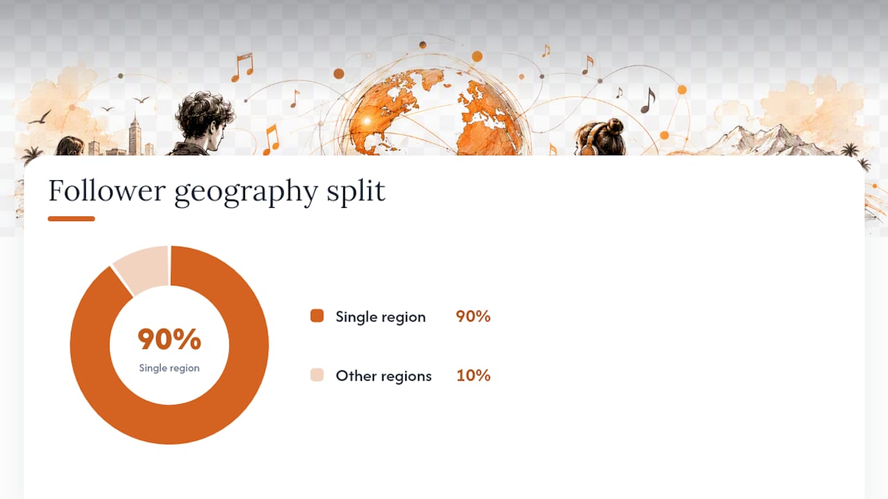
- Check geographic clustering. A “Chill Vibes” playlist with 90% of its followers from one small region rarely reflects organic growth.
- Look at save rate. Genuine curation tends to produce at least some saves; near-zero saves across every track is a warning sign.
Chartmetric and OnesToWatch recommend using stream-to-follower ratios specifically to detect bot playlists, and cross-referencing that with a third-party authenticity score adds a second layer of confidence before you invest more budget in a curator relationship.
Pro Tip: Run this check within five minutes of a new add: pull the playlist’s follower count, glance at its other tracks’ stream counts, and check its country breakdown. If two of the three look off, treat the placement as decorative, not a growth driver.
How Do You Measure Real Campaign Lift?
Raw stream counts after a placement do not tell you what the campaign caused versus what would have happened anyway. Pre/post analysis fixes that by comparing a defined window before the placement to the same window after it.
- Set a baseline window. Use the 14 to 30 days before the add as your baseline, not just the day before, since a single day can be misleading.
- Define the post window. Compare Week 1 and Week 2 averages after the add to that baseline rather than looking at day one alone, which tends to be noisy.
- Account for coincident signals. If you ran an ad campaign or a creator posted about the track in the same window, note it. Otherwise you will credit the playlist for lift that came from somewhere else.
- Calculate cost per listener. Tools like Passive Promotion’s Spotify Campaign Analyzer ingest Spotify for Artists CSV exports and run side-by-side comparisons automatically, producing a clean cost-per-listener figure for each campaign.
This is the pre/post-playlist analyzer concept in practice: baseline-adjusted measurement instead of a single before-and-after screenshot.
Where Does Dashboard Data Actually Come From?
No single source gives you the full picture, which is why most working dashboards pull from at least two.
- Spotify for Artists supplies placement notifications, campaign CSV exports, and listener demographics directly from the platform.
- Chartmetric and Soundcharts add historical adds, playlist stat time-series data, and bot-detection signals that Spotify’s own dashboard does not surface.
- CSV and API ingestion let third-party dashboards pull your exported campaign files and turn them into charts without manual re-entry.
- A manual spreadsheet still has a place. Orphiq’s tracking guide points out that Spotify for Artists shows current placements well but lacks deep historical data, so a simple log covering song, playlist, follower count, add date, and weekly streams often fills that gap better than any automated tool.
Read more on using Spotify for Artists exports to verify placements for a closer look at pulling this data yourself.
What Should a Weekly Dashboard Review Look Like?
Checking the dashboard once and forgetting about it wastes the data you are paying for. A short weekly routine catches problems before they compound.
- Scan the snapshot. Note new placements, any drops, and unread curator feedback.
- Flag anomalies. A sudden stream spike or a playlist that vanished overnight needs a closer look before you draw conclusions.
- Apply decision rules. If a playlist shows strong save rates and a healthy listener ratio, consider reallocating budget toward similar curators. If a placement shows near-zero engagement after two weeks, pause and move on.
- Build a one-page summary. List top placements, total streams gained, cost per listener, and one or two curator quotes for context. Most dashboard tools can export this directly, and platforms like Digitallie specifically map creator posts to streaming changes so you can separate campaign lift from a viral moment that had nothing to do with your playlist pitch.
Pro Tip: Keep the weekly report to one page. Collaborators and labels skim these; a ten-tab spreadsheet gets ignored, a clean summary gets read.
How Intonality’s Dashboard Reflects These Best Practices
Every practice above shows up directly in how Intonality runs a campaign. Curator decisions arrive with real-time updates and written feedback, not a silent yes or no, so you get the qualitative context that raw metrics miss. Campaigns average 4 to 11 playlist placements depending on the service tier, giving you enough data points to run a real pre/post comparison rather than judging a campaign off one lucky add.
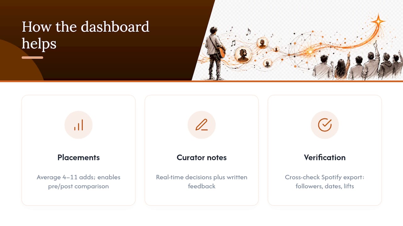
You can verify every Intonality placement independently by cross-checking it against your Spotify for Artists export, confirming follower counts, add dates, and stream lift match what the dashboard reported. That verification step, plus the written curator context, is what turns a placement list into something you can actually act on.
Prioritize These Signals, Not the Ones That Look Impressive
Save rate, active-listener ratio, and curator feedback tell you more than any follower count ever will. A playlist with modest reach but strong saves is worth more than a huge one with dead engagement. Free dashboard views from Spotify for Artists cover verification fine for most solo artists; paid trackers earn their cost once you are running several campaigns at once and need historical comparisons. Whatever your budget, capture fans while you have their attention. A placement is a moment, not a guarantee, so prompt for email signups or a social follow while listeners are actually there.
— Einars
Get These Same Dashboard Signals Without the Guesswork
Intonality gives you the exact signals this guide recommends tracking: real curator decisions instead of automated adds, written feedback explaining every yes and no, and real-time updates the moment a placement lands.
Campaigns typically land 4 to 11 playlist placements depending on the tier you choose, and every placement can be checked against your own Spotify for Artists export, so you are never relying on a promise you cannot verify. If you have been trying to piece together campaign performance from screenshots and guesswork, start a Spotify playlist promotion campaign and see the same dashboard data this guide walks through, applied to your own track.
Where to Go Deeper on Setup and Verification
For the technical side of setup, Spotify’s Campaign Kit covers official campaign tools directly from the platform. Chartmetric’s playlist performance metrics guide explains the Pre/Post-Playlist Analyzer in more depth, and Orphiq’s tracking guide walks through a manual audit spreadsheet if you want a backup to any automated dashboard.
Sources
- Analytics – Spotify for Artists
- How to Analyze Chartmetric Playlist Performance Metrics
- Tracking Playlist Performance Over Time


